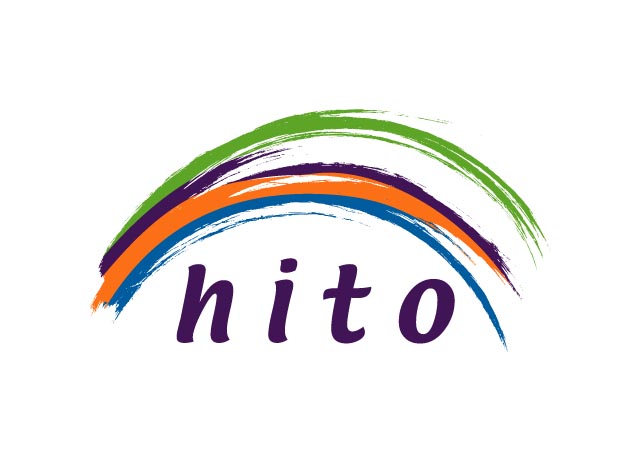
HITO
HITO stands for the Hair and Beauty Industry Training Organisation. They are appointed by the Government to develop and implement industry qualifications for the hair and beauty industries.
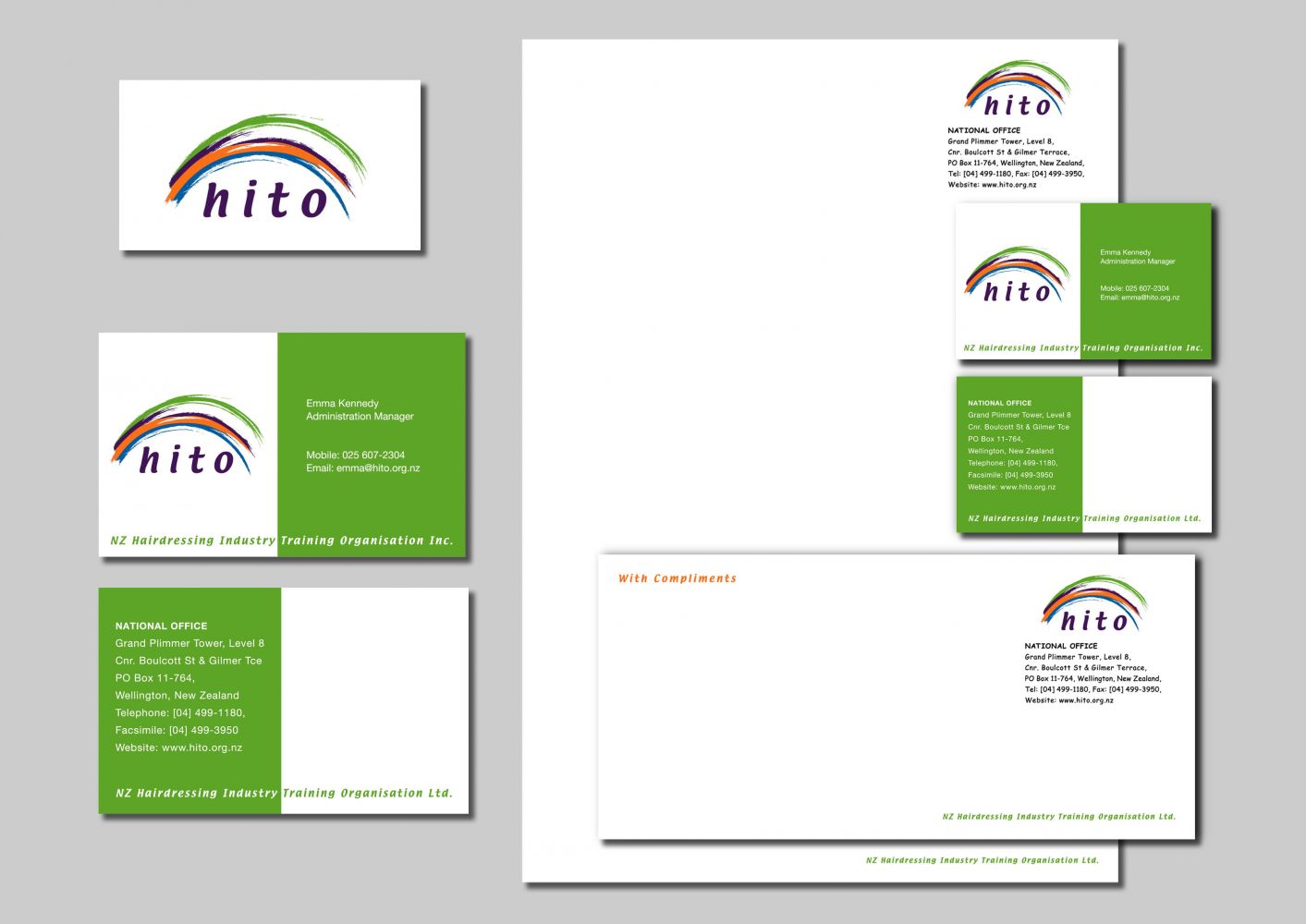
Project: Logo, Brand and Business Stationery Design.
Format: Business Cards, Compliment Slips and Letterhead.
Brief: Hairdressing ITO needed a new company identity after they became an independent incorporated body. The new brand needed to visually represent the four qualifications, as well as the vibrant lively flavour of the industry.
Solution: The combination of a simplistic tactile image of a silhouette of a lock of hair, a modern style font and bright colours create a fresh vibrant ‘look’. The four coloured pieces of hair join at the same point, this symbolizes the joining together of ideas.
“The HITO board were delighted with the final chosen modern logo design, we all love the tactile ‘feel’ created but the lock of hair silhouette. The design process went smoothly, you provided some wonderful design options. Thank you for creating a brand we are all proud of.”
Leslie Hamilton – CEO
Project: Business Stationery.
Format: Business Cards, Compliment Slips and Letterhead.
The brands ‘look and feel’ was consistently applied to the business stationery.